
Introduction
If you are a product designer you've probably heard of design systems. It's an important aspect in your field. Some front end devs already know what design systems are and are probably using them. We have all seen companies like Google, Uber, Airbnb talk about design systems and we're often left wondering, what the heck is all the fuss about.
A design system is a group/collection of components built using strict guidelines and clear standards. According to Stencil Js, A Design System(DS from now on) consists of UI components and a clearly defined visual style, released as both code implementations and design artefacts. When adopted by all product teams, a more cohesive customer experience emerges. Let's break this down.
As part of a design team at a company, you seat down to discuss the design of your next product. You quickly realise that your next product will not have the same visual appeal as your previous product, and your previous product looks nothing like your first product. The problem here is that your design is not consistent. The mobile team is creating something totally different from the web team. This is where a design system comes into play. Having a clear guideline on what your digital products should look like is really important. Here's why:
1. Saves time
When you already a DS implemented you eliminate the time taken to draft up designs and mock-ups for products. When you already have something to reference everything moves quick.
2. A fluent design
The human brain automatically feels comfortable around familiar surroundings. Let's take a logo for example. When a human sees a logo they are familiar with they will immediately recognise the entity associated with it. Same as Google's material design or bootstrap. In the same way, if you have consistent designs on your products users can immediately relate.
3. Maintenance
It's easy to maintain your product's design because the components are modular and reusable. You just have to update the component and you don't have to dive into your messy javascript code. We all write messy code at times.
And that's just the tip of the metaphorical iceberg. Do I have you hooked yet? Here's how you can implement a DS.
1. Evaluate your current design.
Take a look at your current design and decide what you want to keep and what you'd like to discard. Add whatever else is missing while at it.
2. Implement a design language/guideline.
This includes colour, fonts and typography, spacing and margins, shapes etc. Like rounded corners, some unique font, 5 px margins, the colour yellow? Implement that.
3. Decide on a pattern.
You already have what you would like to keep and a design language. Now agree on a pattern: Call to action buttons, active and inactive elements, positioning of elements, font size etc.
4. Document your components.
A wide range of people will be using your DS, so make sure the documentation is easy to follow and comprehensive.
Time to get rid of the bore. Let's get into the good stuff.
Stencil Js
This is a tool created by the team at Ionic to help them build web components for Ionic Framework internally. They eventually realised Stencil's potential and made it open to the public. It's a tool for creating web components or even whole web apps. Paired with Ionic 4 which is now universal(works with any javascript framework or no framework at all thanks to stencil js), you can build a fully optimized Progressive Web App. I will not get into web components in this post but they are what Stencil is created to achieve. I've been using Stencil since it's early beta days and just yesterday on June 6 2019, they released stencil one 🎊🎉🎆. Read more about it on their blog, https://blog.ionicframework.com/.
Prerequisites
- Basic Typescript knowledge
- Node Js
- NPM 6 or higher
Let's get started.
Fire up your terminal 💻 and run:
npm init stencil
You'll be presented with a prompt to choose what kind of project you would like and to name it.
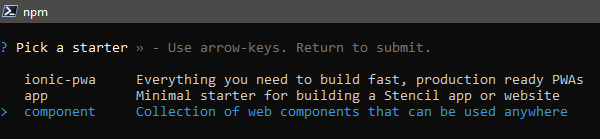
I'd like to make a simple web component. Choose that and give it a name. I called mine ds-tutorial. cd into your project.
cd ds-tutorial
There's a lot of files and folders here so let's see what's important.
- src - This is your working directory, your app lives here and this is where you will be writing most if not all of your code.
- src/components - This is where your component(s) will be. There's already a default component in there.
- src/index.html - This is your app's entry HTML file. Open it and you'll find the default component mentioned above used.
- package.json - Defines your dependencies and some other useful information used by package providers and stencil.
- stencil.config.ts - This contains the configuration for your stencil project. You can add service workers, plugins, generate docs and more. Read more about it here
The rest must be familiar to you. Stencil uses TSX, which is typed JSX. JSX is a syntax extension to javascript and is common in React. It should not scare you off. It's fairly simple to use. It allows us to write our HTML inside javascript files.
Open up your project in a text editor. Visual Studio Code has awesome syntax highlighting and tooling. Navigate to src/components/my-component/my-component.tsx and change the code to
import { Component, Prop, h } from '@stencil/core';

@Component({
  tag: 'my-component',
  styleUrl: 'my-component.css',
  shadow: true
})
export class MyComponent {
  /**
   * Your name
   */
  @Prop() name: string;

  render() {
    return <div>Hello, World! I'm {this.name }</div>;
  }
}
There's a handful going on here. If you've used angular before you'll be familiar with decorators.
@Component({
  tag: 'my-component',
  styleUrl: 'my-component.css',
  shadow: true
})
This decorator provides metadata about our component to the Stencil compiler. I won't get into the details but you can research on decorators.
tagdefines the HTML tag of your web component.styleUrldefines the path to your stylesheet.shadowdetermines if your component will use native shadow-dom encapsulation or not.
Inside your class, there's another decorator
@Prop() name: string;This decorator defines properties which should be passed to our component. Think of these properties as attributes. There's a ton of other decorators which you can read about here.
There's finally the render function. This function outputs a tree of components that will be drawn to the screen.
render() {
    return <div>Hello, World! I'm {this.name }</div>;
  }
Save this file and open src/index.html
Just after the opening body tag, you'll find your component. Make sure the tag matches that in your my-component.tsx file.
<my-component name="Your Name"></my-component>Remember the name property, just like a normal attribute right 😃? Save this file and go back to your console. Make sure you're in the project's root directory and run:
npm start
Now watch the magic happen. Try changing the value of the name attribute in index.html and save. Watch what happens. The changes will be reflected immediately. And it's crazy fast. Now add some styling to src/components/my-component/my-component.css and watch. Play around with these three files. When you're done go to the console and run:
npm run build
This builds your component(s) for production and saves it in the dist folder. You can change this in stencil.config.js. You can now publish this to NPM or some other place. Add a few more components in the components folder and you have a collection of web components, a Design System 😀. Stencil handles all the hard things in the background so you can focus on the easy stuff.
Finalising
You can always visit the stencil website for more advanced concepts and usage. This was just to get you started with Stencil. There's so much more you can do using stencil. I've not even covered a quarter of what stencil is capable of. Try it out, push your imagination to the limit.